Copied from the NIH Extramural Nexus
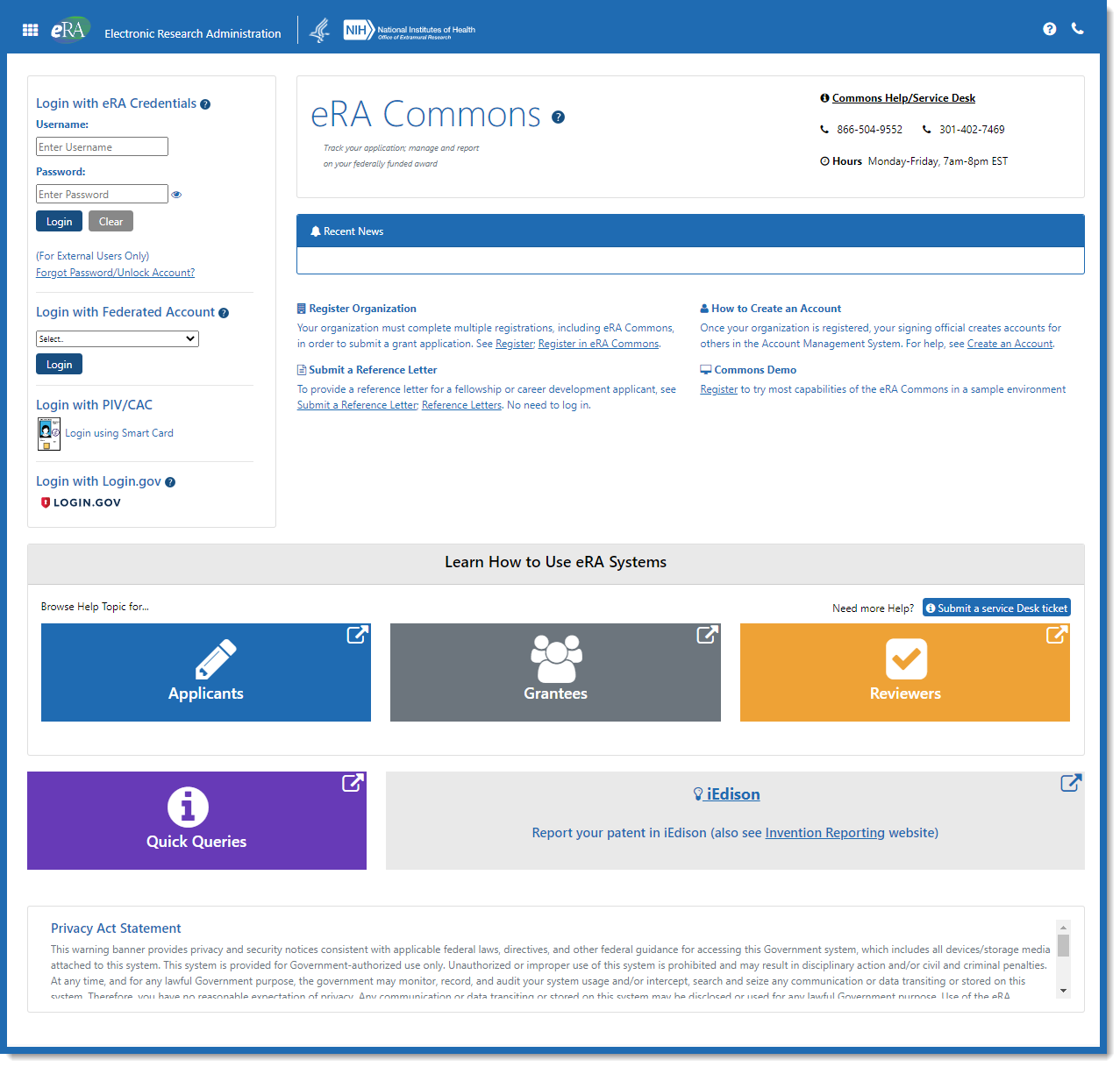
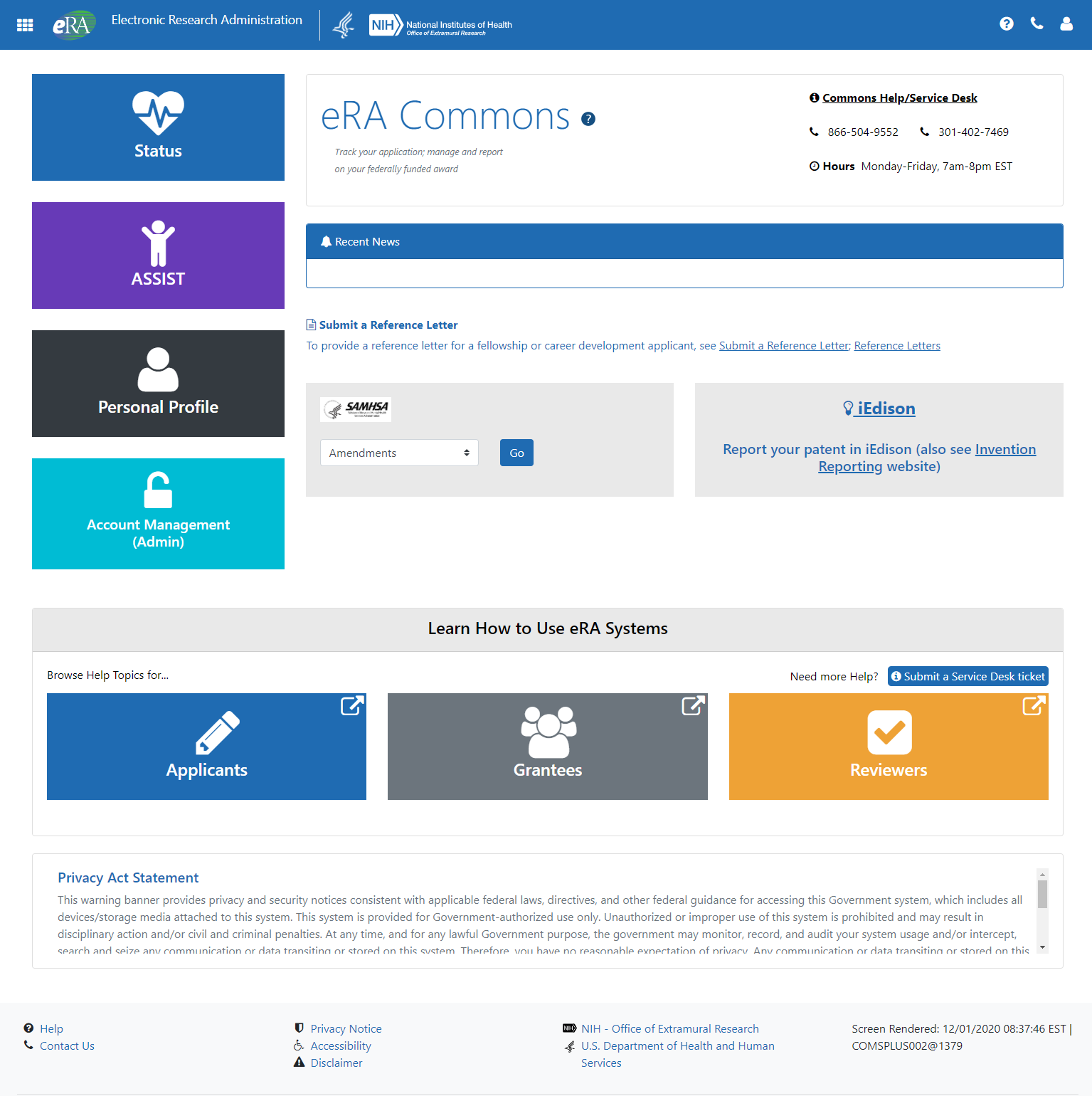
The newly redesigned eRA Commons log-in screen and landing screen, providing a cleaner, modern interface that reflects user feedback, will be released in January 2021. The new design will also provide enhanced security and stability for the Commons module.
The login screen has been simplified by removing much of the non-essential text in the original design. Key resources for institutions new to eRA Commons are now central on the screen. For example, eRA Service Desk contact info, links to register an organization, how to create an account, and how to submit a reference letter are easily located on the screen.

For users new to eRA Commons, links to web pages on how to use eRA systems are presented as large buttons for Applicants, Grantees and Reviewers. Online resources such as Quick Queries and iEdison (where patent and invention reporting is done) are provided as well for easy access.
Once authenticated to access eRA Commons, gone is the cluttered navigation bar. The landing page has been redesigned to provide quick access to the most commonly used modules: Status, ASSIST, Personal Profile, and Account Management (formally the Admin tab) via large buttons along the left side of the screen.

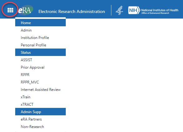
A significant change is that navigation to other parts of eRA Commons will now be through the apps icon (sometimes referred to as a bento box), a nine square icon located in the upper left corner of the screen. Clicking this icon will present a drop-down menu of the eRA modules available to the user.

As on the log-in screen, there is a link to iEdison and links to eRA webpages for Applicants, Grantees and Reviewers. These are clearly marked as external links, meaning you will be clicking away from eRA Commons.
Note: SAMHSA users, once logged in, will go to the SAMHSA box on the landing page (next to the iEdison box) and choose from the drop-down menu listing Amendments, Continuations and Supplements, and then click the Go button.
Resources